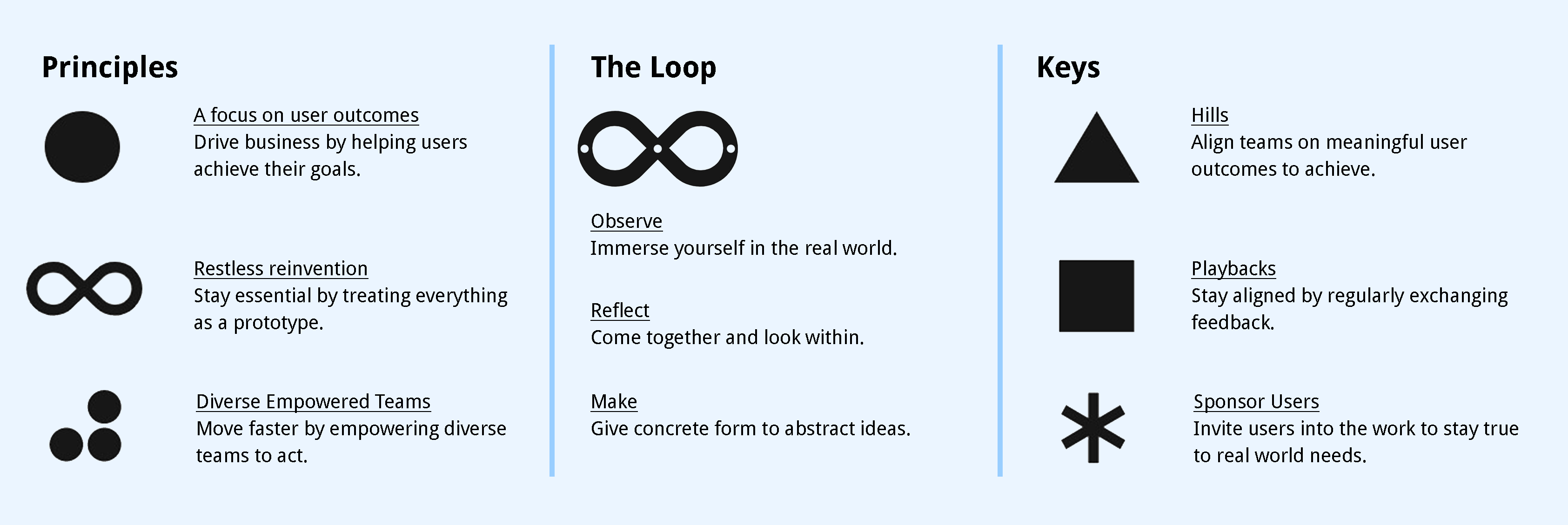
We used IBM's Enterprise Design Thinking methodology through our sprint cycle.
" At the heart of our human-centered mission is Enterprise Design Thinking: a framework to solve our users’ problems at the speed and scale of the modern enterprise."
A study conducted by the NHCA in 2015 shows us that, 60% of students report tremendous levels of stress and 65% feel overwhelming anxiety but only a very small percentage are actually able to receive guidance through university resources.
A report by ACHA in 2017 shows that the top 3 stress factors are academic performance, pressure to succeed and the pressure to have solid post-graduation plans. There are also non-academic factors that contribute to stress such as moving to a new place or country, being away from family, and financial pressures.
Our team conducted Primary and secondary research at the beginning of the project. We a drafted series of survey and user interview questions, planned the usability studies, and conducted benchmark analysis. Needs, pains, and problems are collected from representative users who were current UofT students.
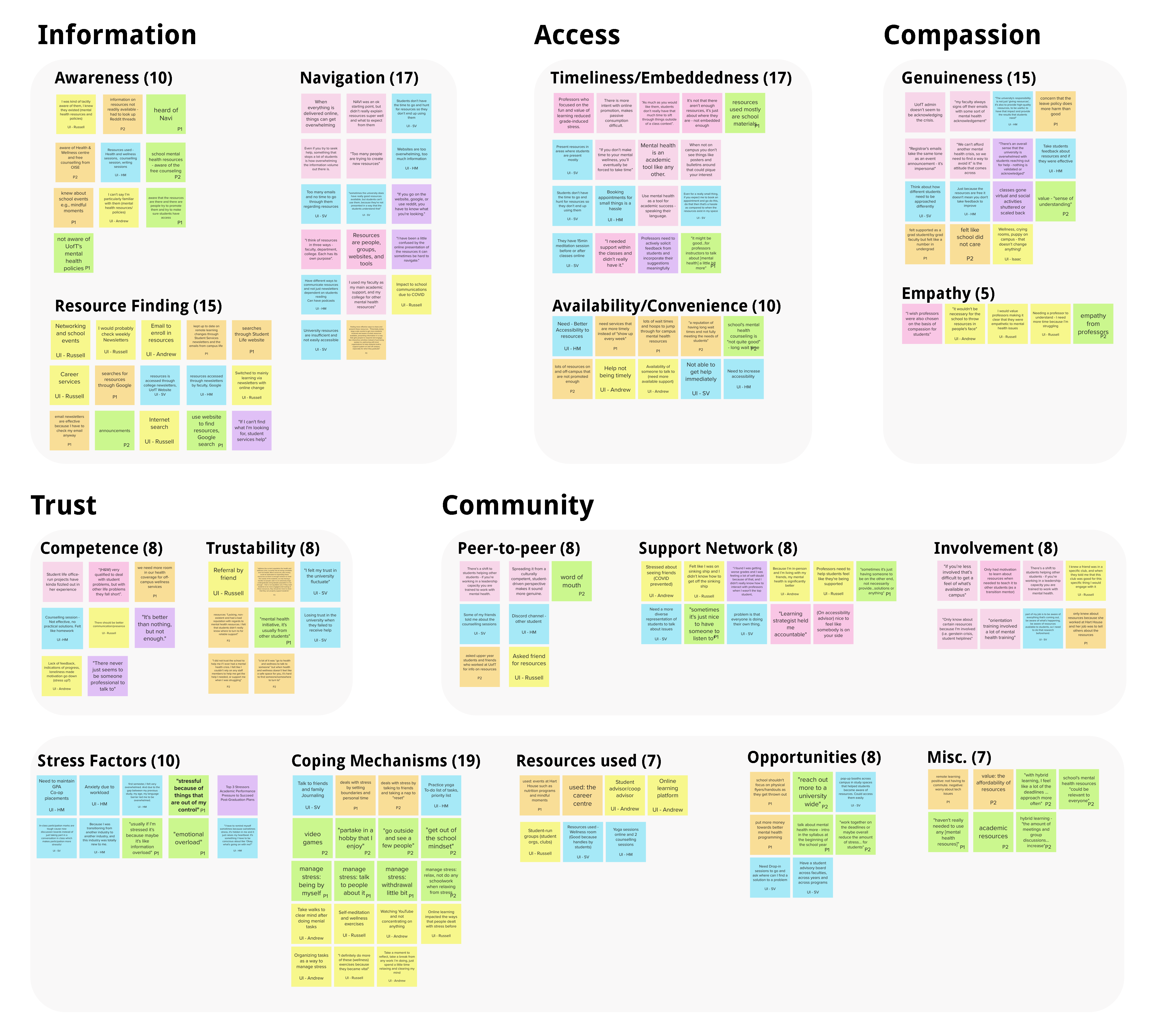
Based on these responses we then created an affinity map to find themes and cluster our research findings.
From synthesizing our participants and survey respondents, we conceptualized a persona who is an academically driven undergraduate student and is constantly juggling their priorities - the last of which is themselves. On an average day, their task list strikes a balance between their academic drive, their daily engagement on campus, their go-to information networks, and their overall sentiment about their time at university.
After developing an As-is Scenario we identified pain points that our persona goes through their journey while trying to find mental health resources. These pain points helped us create need statements which guided our design and solution.
These goals helped us map out the user flow and create low fidelity sketches for the screens by asking ourselves WHO-WHAT-WOW as we framed these statements.
Based on the prioritized features, we established the user flow and sketched out initial screens to test internally.
To get a better sense of what the ideal scenario could look like, we conceptualized a flow journey, map out the experiences and steps our solution would require. We did this through a Minimum Viable Product lens, where we identified screens that were core to completing tasks. This was crucial for helping us identify what we needed to ideate upon for this first design cycle. We individually drew concepts for different steps and implemented a voting system to align on which designs to move forward with.
The low-fidelity screens were tested out with 3 participants using lean evaluation. This helped us identify areas of improvement which would help us while designing our medium fidelity prototype.


The video below summarizes our approach and need for this solution to be introduced for the students at University of Toronto.
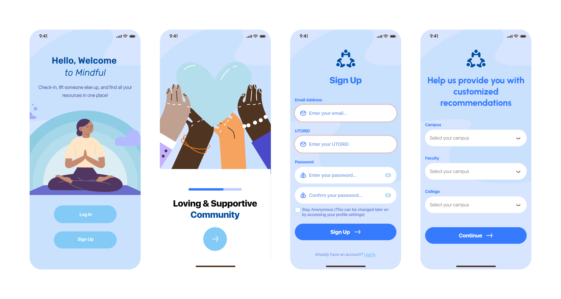
The onboarding process helps new users understand the features. Once users login/sign up they are asked a few questions to help provide customized recommendations. This will help unique to their preferences. They can also choose to stay anonymous which allows U of T students to manage time more efficiently.
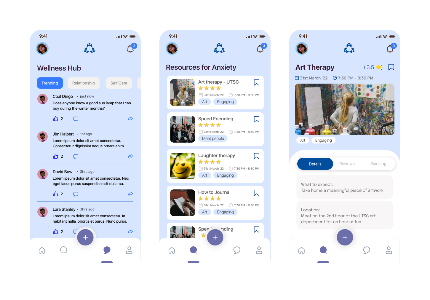
Users can choose from different modes to look for resources. Based on the mode they are directed to the search results page where they can further filter and sort results to find their preferred resource. They can then read more about the resource, go through reviews and finally book it based on their schedule and need.

Students can now use the chat forum to share their thoughts and feeling or even reach out to others. The forum has the option to post anonymously for those who are shy. They can also upvote or downvote posts while also being able to directly respond to posts.
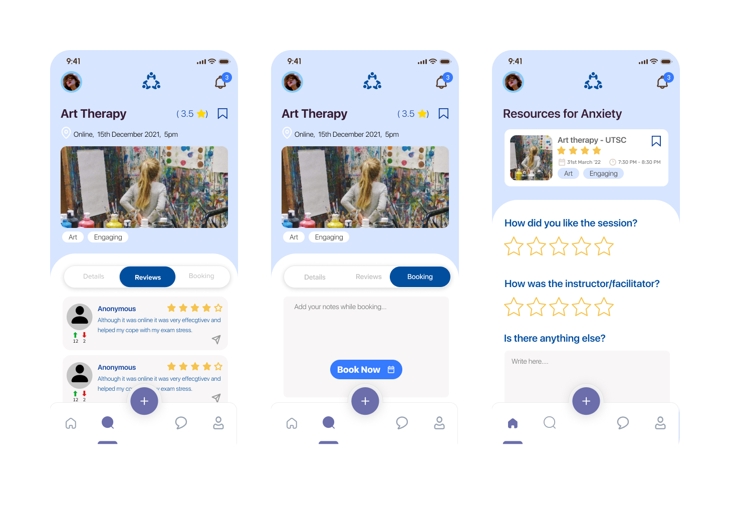
After attending an event or using a resource users will be able to access their bookings and leave their feedback. They can provide star ratings, describe their experience and tell us with topic this helped them with so that we can suggest this to future users.

While we recruited a relatively diverse body of participants for our interviews and evaluations, if we are to truly design a solution targeted to the vast UofT student body, the more subsets of users involved, the more robust our design can be.
With such a wicked topic as mental health on campus, we would hope to involve the voices of the mental health experts in both interviews and their very own usability tests - while they are not necessarily our target users, the insight they could offer about our direction would be invaluable.
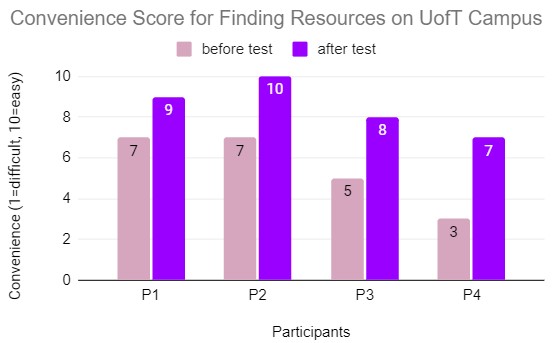
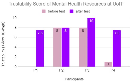
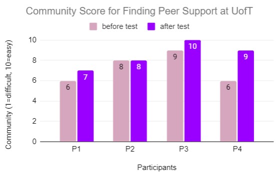
While we were able to collect some “before” and “after” data for our three components in the usability test, cross-referencing with our lean evaluation as well, our timeframe for these data points are relatively narrow and potentially skewed. It would be more impactful to have usability metrics that involve user opinions after engaging for days.